
Usually, working with geographic data, you have to use GIS software. For plotting multiple plots with the same quality might be cumbersome. Hence, some people choose to automate the process; I was also struggling to do the same. So here is a simple example of plotting a GeoTIFF file.
First of all load your dataset using xarray.open_rasterio.
import xarray as xr
dem = xr.open_rasterio('https://download.osgeo.org/geotiff/samples/pci_eg/latlong.tif')
dem = dem[0] #getting the first band
The easiest way to plot is by using the plot function of xarray dem.plot().
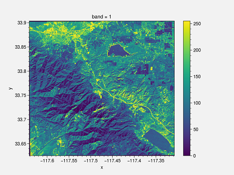
This plot has certain drawbacks. First of all, x and y labels are too small; the title is “band 1”, and the colorbar need to be changed. You can change it to make it suitable for publishing.
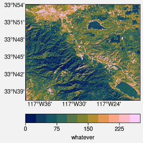
I am using ProPlot. This is an impressive library for publication-quality plots. This is the whole script and output.
Python Script
import proplot as plot
import xarray as xr

dem = xr.open_rasterio('https://download.osgeo.org/geotiff/samples/pci_eg/latlong.tif')
dem = dem[0]

# Define extents
lat_min = dem.y.min()
lat_max = dem.y.max()
lon_min = dem.x.min()
lon_max = dem.x.max()

#Starting the plotting
fig, axs = plot.subplots(proj=('cyl'))

#format the plot
axs.format(
    lonlim=(lon_min, lon_max), latlim=(lat_min, lat_max),
    land=False, labels=True, innerborders=False
)

#Plot
m = axs.pcolorfast(dem, cmap='batlow')
cbar = fig.colorbar(m, loc='b', label='whatever') #Adding colorbar with label

#Saving the Figure
fig.savefig(r'geotiff.png')
Explanation
- Basic import stuff for Python
import proplot as plot import xarray as xr - Open the GeoTIFF dataset using
xarray.open_rasterioand get the first band of the image. You can select a different band if you have multi-band GeoTIFF.dem = xr.open_rasterio('https://download.osgeo.org/geotiff/samples/pci_eg/latlong.tif') dem = dem[0] - Get the extent of the dataset. If you have a global dataset, then there is no need.
lat_min = dem.y.min() lat_max = dem.y.max() lon_min = dem.x.min() lon_max = dem.x.max() - Create the figure and axes with projection system. Here,
proj=('cyl')means the CartopyPlateCarreeprojectionfig, axs = plot.subplots(proj=('cyl')) - Format the plot. Here,
lonlimandlatlimare the zoom locations of the axes. If you are using a global dataset, then you can ignore it. Turn on/off the various geographic features such asland, ocean, coast, river, lakes, innerborders, etc.. To turn on the lat and long labels uselabels=True.axs.format( lonlim=(lon_min, lon_max), latlim=(lat_min, lat_max), land=False, labels=True, innerborders=False ) - Finally, plot the dem using
pcolorfast. It is good enough for fast processing of the GeoTIFF files.pcolormeshtakes a longer time to process but can be used. The colormap used isbatlow. For more colormaps you can check usingplot.show_cmaps(). Save the figure to your deired location.
m = axs.pcolorfast(dem, cmap='batlow')
cbar = fig.colorbar(m, loc='b', label='whatever') #Adding colorbar with label

#Saving the Figure
fig.savefig(r'geotiff.png')
